Vibes to Aesthetic: How AI Finally Unblocked My Website Redesign
Redesigning a personal website can feel like an endless loop of trial and error. After several failed attempts to upgrade my site to something more modern, I finally found success by collaborating with an AI tool. Here's how I transformed my website from initial struggles with Tailwind CSS to a sleek personal style.
Sapper
Sapper served me decently well. It was a Svelte full stack framework that had since been succeeded by Svelte Kit. It was manually and amateurishly styled by Tailwind and I even got a semi decent blog post out of the process: Making sense of Tailwind in Svelte. You can also see the prequel to this blog post here that discusses the technology choices.

I did run into some issues, though:
Sapper was deprecated and SvelteKit was the new hotness but every time I tried to upgrade I got inscrutable errors.
Lost affinity with Svelte due to just not using it. For whatever reason it fell out of interest to me.
It was unexpectedly a lot of manual work to write blog posts due to my (poor in hindsight) decision not to use Markdown.
Eventually I outsourced blogging to Hashnode, making sure to keep it pointed to my domain (via a subdomain).
Someone else’s Astro
Astro came out and I loved its promise of just getting out of your way to make simple content websites. Markdown is a well handled pathway to content. Data collections are flexible and easy to use. It is flexible enough to use any framework but the built in framework is already a great combination of Svelte and markdown simplicity.
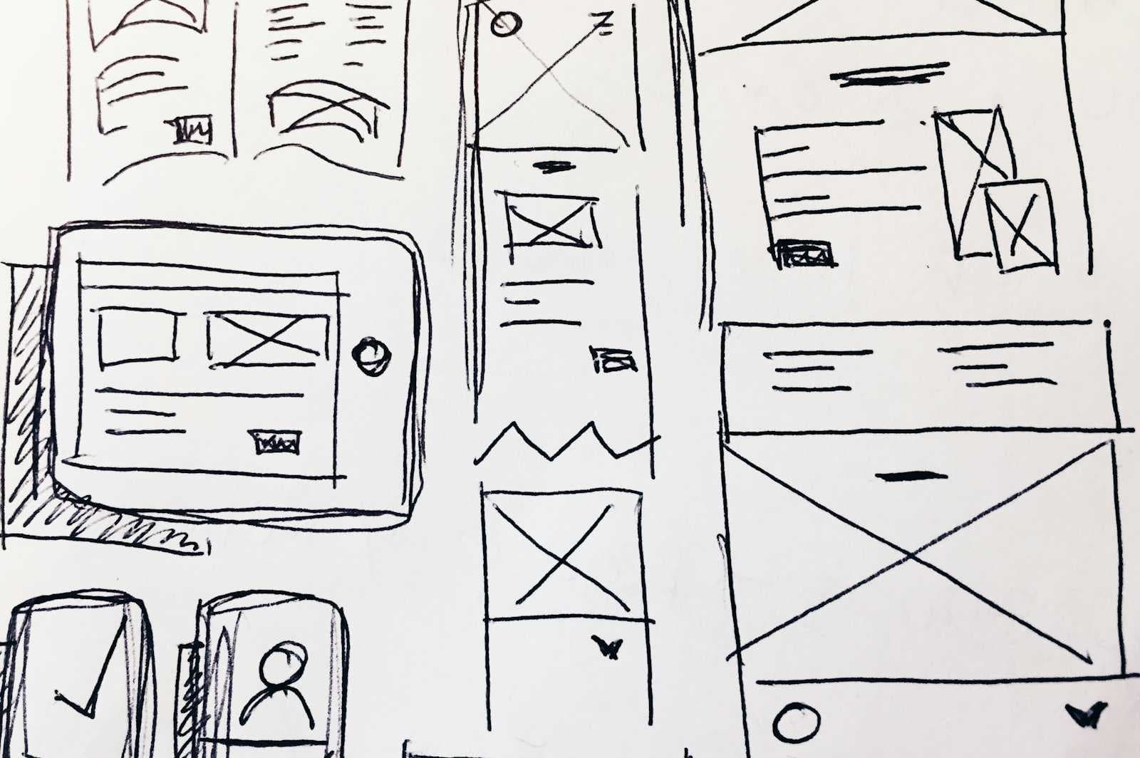
Astro made it easy to build but it didn’t solve choosing what to build. I tried looking at their theme gallery and made some progress on adapting one but I never felt the excitement about the final goal and petered off. For side projects, interest is a very powerful signal that should be listened to and it was telling me that this was not the way to go. This is one of the reasons that I don’t do design and have so much respect for practitioners. I know when something looks good but I have no idea how to get there myself.
My artistic influences
To combat the “blank canvas” problem I browsed theme galleries of astro and Hugo. There were a few things that caught my eye:
Bear blog
I loved the focus on simplicity and content. I liked not having to “say anything” about design until such time I had something to say. It seems stark and even slightly brutal but it doesn’t but any barriers between you and your content.

Bento themes
While I like simplicity, I also appreciated the structure that bento style layouts offered. I found it modular and simple to implement. It was a toolbox that wouldn’t get in my way.

Increased contrast mode in Mac OS X
This is a bit of a weird one but in Mac OS X there is an accessibility mode that’s an intermediate step from the full on High Contrast theme. It highlights buttons, emphasizes borders and accentuates the structure of the user interface in a pleasing way. Unfortunately it does not seem supported in websites or even applications outside of native Apple ones but I find it appealing.

v0
Vercel’s v0 is a fun AI tool that generates React applications for you. I’ve used it in the past to create some small tools for myself but I did notice that the websites it created always had a slick look and feel. On some level I thought that these were cardboard stamped out to be identical shadcn base style uniformity. Not knowing what would happen I described my influences and with a little bit of refinement I came out with something that excited me:

I loved this. It suddenly became easy to work on my website. I adapted the NextJS output to Astro as necessary, something that the framework’s flexibility lent itself well to, and I had it.
Final thoughts
In a sense this was stretching myself to come up with a personal design. At my job there are usually very good people that do this for me. I think this is actually in the sweet spot for applying AI: enough context to judge output but just outside of my skillet to do myself with any sort of efficiency. Taking the chance to push tools farther than you may think is also something well worth doing with this new technology.
This experience taught me the value of stepping outside my comfort zone and exploring innovative tools. I hope my journey inspires others to experiment with AI in their own projects. Check out the updated site at kaan.fyi and feel free to share your thoughts or experiences with similar redesigns.